HUDDLE HOUSE
―
Huddle House has been an incredibly interesting challenge on all fronts. They were a brand that had a long history of southern charm & hospitality and great breakfast but had lost their way in terms of communication and branding.
We stepped into to help them communicate to a broader set of potential customers, give them a strong digital presence, and update the brand look and feel. This has led to a huge variety of projects from new menus, website, photography, and brand colors, to brand strategy, new media, and loyalty programs.
Where they were
Above is a quick snap shot of the state of Huddle House when we stepped in. There was a lot of brown, bad typography, and very dark photography. The messaging was also not doing them any favors. Most of it centered around the words “New” “Limited Time or a price point.
We needed to figure out how to bring them into the 21st
century while maintaining the core of their brand.
WHERE WE TOOK THEM
One of the first things we wanted to figure out was a rallying cry. Something beyond a tagline - something that could be used both internally and externally. We wanted to capture the fact that Huddle House is a friendly, warm space, where you’re encouraged to make the meal your own. When you walk in the door you’re greeted with a, “darlin’” or “sweetheart”. And we wanted the company to have a goal for what they needed to achieve from operations to communications.
MESSAGING
Your House Your Kitchen was our answer. This phrase really encapsulates the Huddle House experience and is great invitation to all of their customers. What this has led to is more brand work, great customer activations, and opening up the brand to their guests.
A lot of what we needed to change up was their look and feel. But we also needed to start communicating in a way that appealed to a larger audience - including families and younger people.
The photography was a huge part of this. Their current photo library was dated, inconsistent, and didn’t add any cravability. We need to make the food feel brighter, more inviting, and lessen the brown tones. The food had enough yellow and brown - we didn’t need to add to it.
So, we found a new photography studio where we could shoot in natural light, picked brighter surfaces for breakfast (our main staple), and worked on better styling and angles. The results speak for themselves. It’s the same items just approached differently. And my favorite bit is all our shoots are done with their actual food.
PHOToGrapHY
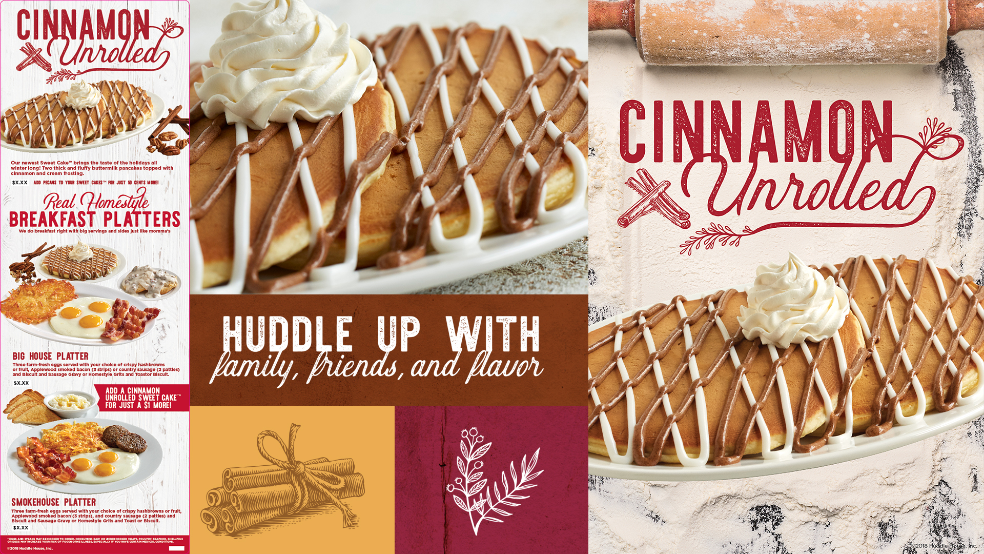
Below is a couple of examples of campaigns I’ve done for them utilizing new brand fonts, colors, and photography. A big part of these was allowing each campaign to have its own look & feel that while still living underneath the Huddle brand stood out in store and in our communications
POP & CAMPAIGNS
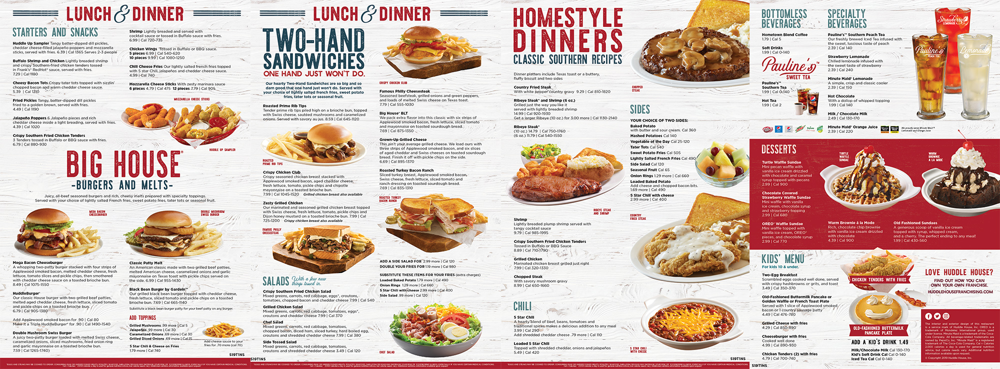
This was a project that I was really excited to work on. The previous menu was painfully outdated and was really sticking out among all the new changes. We got to integrate our full new brand into this version of the menu and it has been well received.
MENU DESIGN
The website was a big undertaking mainly because we wanted to build a seamless menu and online ordering experience. What we were able to create quickly brings people into the food, our ongoing specials, and getting them to sign up for loyalty and email programs. The online ordering part recently launched and is helping push incremental sales.


